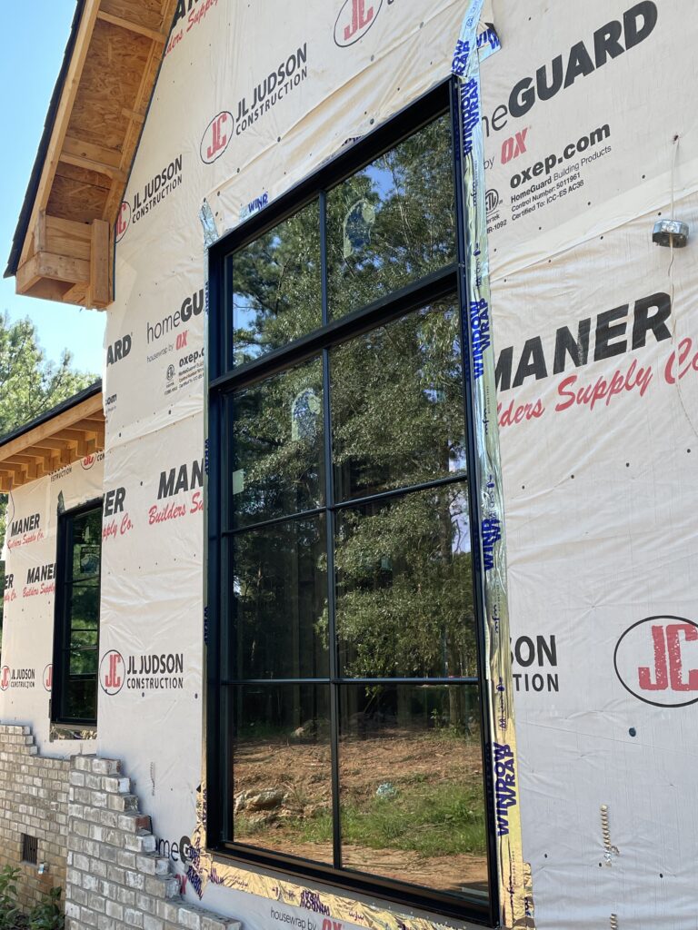
Things are finally moving again over at the KHM home site. We were at a standstill for what felt like forever waiting on windows and doors. They finally came in last week and were installed on Monday. We wanted big, modern, statement windows (that didn’t break the bank) and we feel like we definitely got’em! I mean, y’all, look at these!
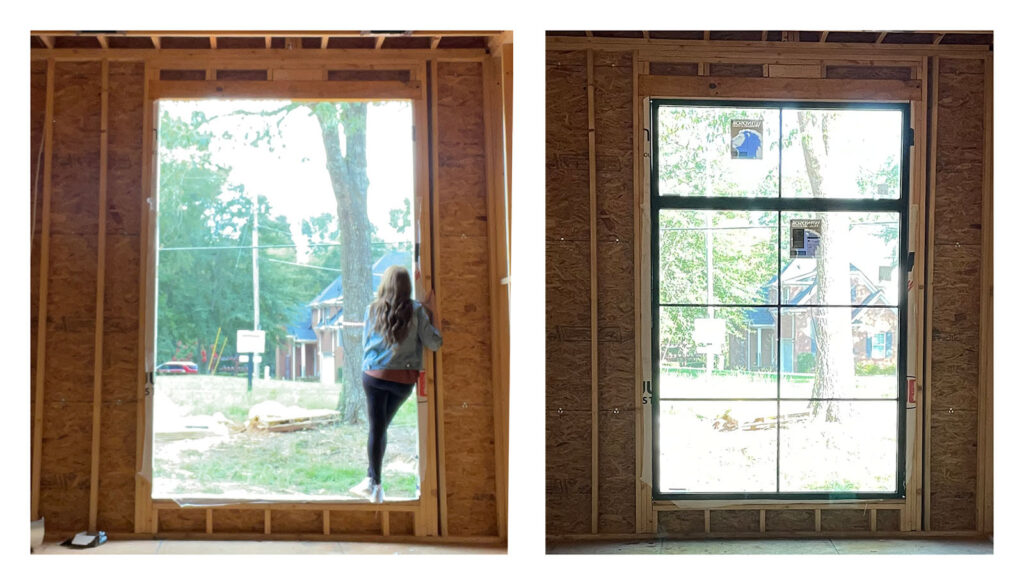
And here is the before and after of our office window:
But anyway, that’s not what this post is all about. I thought I’d share another one of our design boards- this one is for our powder room. Let me give you a few details about this space:
It’s a modest size, measuring 5 feet wide by just over 7 feet long. It does have a fairly large window which is really nice for letting in natural light. Wait, before you say “hey that’s creepy, people can see into your powder room”, no they really can’t. The end of the house that the powder room is on is much higher off the ground so, even if someone is standing directly under that window, they can’t see in at all. Plus, we made the bottom of the window just above waist height when you’re in that room so even if someone could see in, they won’t get much of a show. 🙂
Here’s the direction for the design of this room:
Focal Point(s)
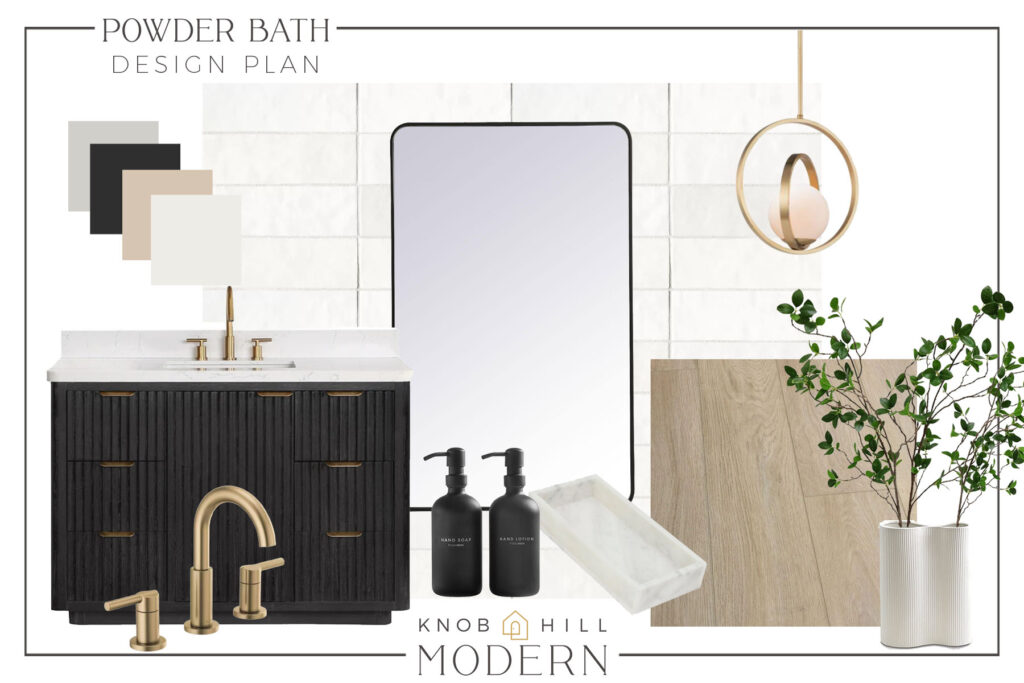
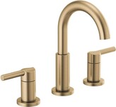
Well, it’s a powder room so there’s not alot to cover, but there is a focal point in here and it ain’t the toilet, ha! Here’s the plan. Since we’ll be going with either a waterproof engineered wood or an LVP flooring for most of the house, we decided to carry that same flooring into the powder room as well. We could have done tile floors but I liked the idea of having the warmth from the wood to contrast the gorgeous black vanity. And speaking of vanities, this one is a stunner! I love the reeded details on the doors and drawers, the brushed gold hardware, and the rounded corners of the stone top. Those details help to elevate it and give it a more modern look. The Delta Nicoli faucet has a nice sleek look and the champagne bronze ties into the brushed gold vanity hardware as well as the brushed brass of the pendant lights.
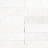
We opted for this Cloe tile in a “stack bond” pattern as an accent wall behind the vanity. To tie in with the black color and rounded corners of the vanity, the mirror is a rounded rectangle frame in black. A large round mirror would have worked well in this design too but our pendant lights are round (more on those in a minute) so I decided against having round on round on round. The rounded rectangle shape still has some softness but will stand out against the round fixtures. The mirror comes in lots of sizes too so it would work well in pretty much any space.
The lighting
Since powder rooms are usually for a quick visit and not necessarily where you’ll be applying makeup or needing tons of light, you can afford to go a little moodier in a room like this if you like. I love the look of those little jewel box powder rooms with bold, statement wallpapers but, in the end, that just isn’t us. We chose to keep things simple, clean and, of course, a little bit modern.
Although we didn’t need to be concerned about having lots of light sources, we certainly do have them! The window will bring in lots of natural light, plus we have one recessed light as well as 2 pendant lights– one on either side of the sink. I love the clean, simple look of these lights and the brushed brass finish and round shape will be a nice accent against the straight lines of the tile and black mirror.
Details & Accents
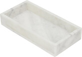
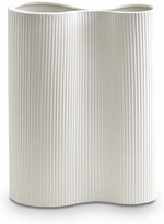
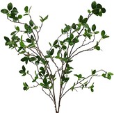
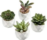
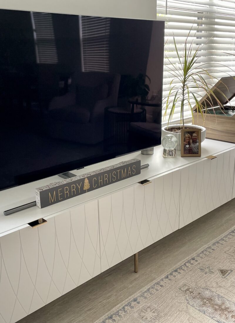
I think every room needs a little greenery or a plant to add some life to it. I like the idea of bringing in a modern vase with some taller stems to add a little height to the countertop. You could also add in a small woven or marble tray with a potted succulent and maybe a candle on the back of the toilet. I like using trays to organize things like soap/lotion pumps as well.
We will probably be adding a larger piece of art on the toilet wall but we are still on the hunt for that.
Color Palette & Design Style
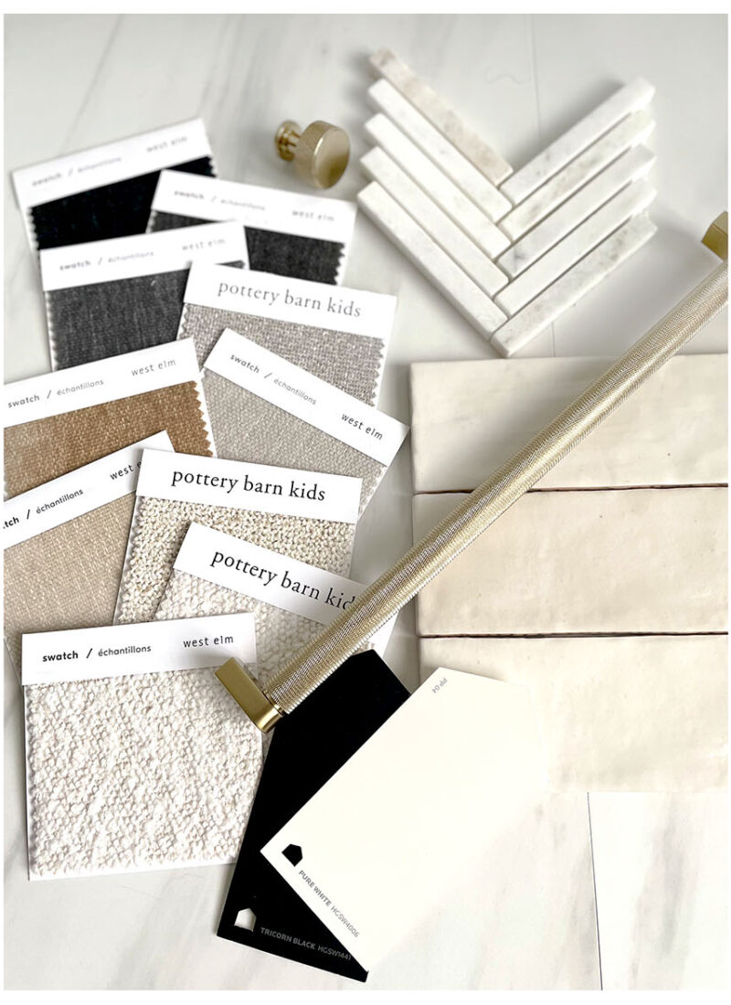
As with all of our other design boards, the color palette for this room (and, really, the whole house) will be SW Pure White, SW Tricorn Black, SW Touch of Grey, with touches of fawn and light caramel’y tones.
Until next time…

*This post contains affiliate links, so we may earn a small commission when you make a purchase through links on our site at no additional cost to you.
You can shop this design board by clicking the images below or shop any of our other looks by clicking here.



Leave a Reply